If you’re only now finding out about Crisp Bounce Pass, you can subscribe here!
If you’re enjoying Crisp Bounce Pass, please forward this email to your friends! 🏀
Today’s email is part of our “Branding Lowdown” series, and we’re gonna explore the Milwaukee Bucks. They’re currently sitting at No. 1 in the Eastern Conference standings—oh, and speaking of sitting, that’s what their first logo is doing.

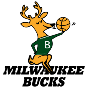
1968-1993
The Bucks popped into existence on May 22, 1968. More than 14,000 people suggested a name for the team, but it was R.D. Trebilcox (a man with a great name himself) that ultimately received credit for coming up with “Bucks,” since the animals were “spirited, good jumpers, fast and agile.” For his trouble, Trebilcox won a new car. It’s just like being on The Price is Right!
This logo, which stuck around for 25 years, features a snazzily dressed Buck perched atop the team name while spinning a basketball and looking QUITE pleased with itself. I’m actually a little mad this logo doesn’t still exist, because it’s great.

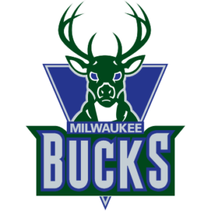
1993-2006
Deciding the Bucks name should instill some more fear into opponents, the team ditched the clothing and opted for a more front-facing buck instead. This logo was introduced to commemorate the 25th anniversary of the team and features an eight-point whitetail buck. It also leans more heavily into the purple and silver part of the team’s color scheme while still maintaining the hunter green element.

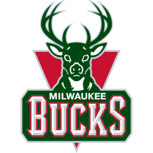
2006-2015
Let’s hop into the pitch meeting for this iteration:
Creative Design Lead: Okay, we’ve developed 12 new directions for the logo—looking forward to walking through them with you.
Executive: No, we fear change. How about we just adjust the colors and make “BUCKS” simultaneously more rounded and pointed.
Creative Design Lead: But we really spent a lot of time and energy on these other ones…
Executive (scribbling crayons onto a napkin): See? Like this. It’s perfect!
The Bucks had only one winning season during this logo’s lifespan and never made it out of the first round of the playoffs. It clearly carries a stench of failure with it, so it wasn’t long for this world.

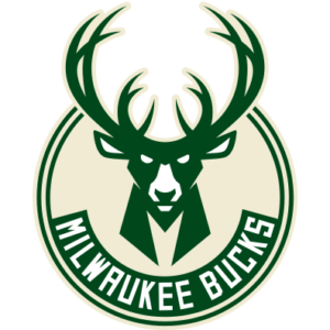
2015-Present
The official NBA page for the Bucks history says “the new Buck is only looking ahead, an imposing figure determined and focused on the path in front of him.” It raises an interesting question about the previous two logos, which also seemed to be looking ahead. Maybe there was a lazy eye situation going on and those other Bucks were actually staring to the side.
Either way, there are a couple of cool features about this modern-day logo:
- The Buck now has 12 points, instead of 8. It has GROWN.
- The chest, which could potentially be mistaken for a fancy tuxedo, is actually an “M” for “Milwaukee.”
- The negative space in between the antlers is a basketball. 🤯
Led by their star Giannis Antetokounmpo—a.k.a. “The Greek Freak” for people that have trouble pronouncing lengthy last names—the Bucks are experiencing a renaissance they haven’t seen since the early days of the franchise 50 years ago.
That’s all ’til next time. Thanks for reading!
Joey
3 thoughts on “Issue 3: Lookin’ Like a Million Bucks”
Comments are closed.