If you’re only now finding out about Crisp Bounce Pass, you can subscribe here!
If you’re enjoying Crisp Bounce Pass, please forward this email to your friends! 🏀
It’s been a hot minute since we’ve done a branding deep dive, where we take a look at a team’s logo history. Today’s squad: the Chicago Bulls.
Since the Bulls joined the league back in 1966, they’ve had the exact same logo. That kind of longevity is impressive, but it doesn’t make for a particularly fascinating deep dive, does it?
Luckily, the Bulls are actually the third iteration of a Chicago professional basketball franchise. Let’s see what the city trotted out before them.
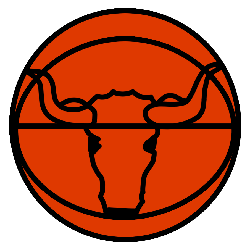
Chicago Stags (1946-50)
![]()
When I was a kid, I used to draw logos of NBA franchises in my notebook. I was (and still am) a pretty terrible artist, so the logos were incredibly uncreative, sometimes simply being letters moving in different directions. I remember for the Atlanta Hawks I would draw a very aggressive M because it looked like a hawk spreading its wings to me (and no one else).
Anyway, that’s what this logo reminds me of. The stag itself is far more impressive than anything I can put together, and I love the shading techniques used on it.
But the “Chicago” and “Stags” hastily scribbled over a basketball? That’s something I could manage to do, and probably created something close to it in my notebook.
Anyway, the Stags only played four seasons — three in the Basketball Association of America (BAA) before that league merged with the National Basketball League (NBL) to form the National Basketball Association (NBA).
The Stags played their final season in the NBA, and I gotta say, this was a pretty successful franchise. The Stags reached the playoffs all four years, finishing with a 145-92 record in the regular season, a .612 winning percentage. Sure, they only won about a third of their games in the playoffs, but no one remembers that.
Chicago Packers/Zephyrs (1961-63)
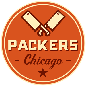
No, this is not a typo. Chicago once had a team named the Packers. In fact, they were the first modern expansion team in NBA history.
The nickname was in honor of Chicago’s meat-packing industry, and both logos pay homage to that. Unfortunately, the Green Bay Packers already existed in the NFL, and they were the biggest rivals to the Chicago Bears. So that name only lasted one year, a season when the Chicago Packers went 18-62, managing only a few more wins than Green Bay did that same year.
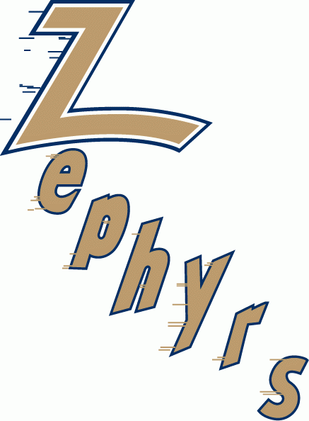
In 1962, the team changed its name to the Chicago Zephyrs, which also happened to be the name of a junior high traveling team I played on in the Chicago area.
I didn’t understand the name then and I still really don’t now. There are Zephyr trains across the country, but the actual definition of “zephyr” is a gentle breeze. I guess the logo reflects that? The letters do seem to be scattered about as if they’re caught in an updraft. In any case, this team was also bad, finishing 25-55 in its lone season.
After one season apiece as the Packers and Zephyrs, the team packed up their sneakers and moved to Baltimore. That team is now the Washington Wizards. And just like the Packers and Zephyrs were, the Wizards are quite terrible right now. Glad to see the tradition lives on!
Chicago Bulls (1966)
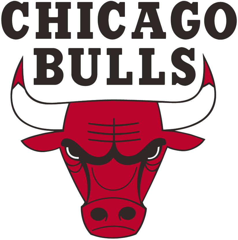
Alright, here we go! The ol’ classic Bulls look.
For how timeless this logo is, there’s quite a bit of mystery surrounding its creation. Dick Klein founded the team in 1966, and according to Chicago History Museum chief historian Peter T. Alter, wanted a name like “Matadors” or “Toreadors.”
Klein shared his ideas with his son; he allegedly responded, “dad, that’s a lot of bull.” Boom. There’s the name. Now, for the logo.
Klein turned to commercial designer Dean Wessel, who designed this scowling bull in exchange for free tickets. Klein was onboard with the logo, but wanted some blood on the horns. Wessel happily obliged, though as far as I know, no Chicago Bull has actually gored an opposing player. Dennis Rodman did kick a photographer once, though.
That’s according to the Chicago Tribune, at least. But the Trib and Associated Press have also credited Ted Drake for designing both the Bulls and Notre Dame Fighting Irish logos. So no one really knows who designed it. Mysterious, indeed.
Either way, the Bulls logo is one of the most iconic in sports. You’ll see people rocking a Bulls hat with absolutely no affiliation to the team. It’s just a cool color scheme and a good lookin’ logo. And if you REALLY want to get fired up, watch the Bulls intro video, where animated bulls run throughout the Windy City en route to play basketball.
Share Crisp Bounce Pass with a friend!
The Betting Area
If betting is legal in your state, you can play at BetRivers and BetMGM AND score a deposit match up to $250 or $500, depending on your state.
Pennsylvania
Get an instant deposit match up to $250 at BetRivers.
Illinois
Get an instant deposit match up to $250 at BetRivers.
Colorado, Indiana, Iowa, and Tennessee
Get an instant deposit match up to $500 at BetMGM.
Gambling problem? Call 1-800-GAMBLER (NJ/PA/IL) or 1-800-9-WITH-IT (IN only) or 1-800-BETS-OFF (IA only) or 1-800-522-4700 (CO Only) or TN REDLINE: 800-889-9789.
Other Reads and Watches
Fake NBA Awards for the first quarter of the season
That’s all ’til next time. Thanks for reading!
Joey
P.S. Did you get this email forwarded to you? Subscribe to Crisp Bounce Pass here.
One thought on “Issue 54: An UnstoppaBULL Logo”
Comments are closed.