Don’t look now, but the Minnesota Timberwolves are the hottest team in the NBA. Okay, maybe not, but they’ve certainly played better of late, winning 6 out of their last 11 games. And Alex Rodriguez just agreed to buy them!
More importantly, they’ve continued to entertain despite a lost season. Whether it’s Anthony Edwards dropping hilarious lines in postgame interviews or D’Angelo Russell mistaking a sign for a chair and falling down, they’re becoming must-watch TV.
Oh, and the basketball is pretty good, too. But for the purposes of this email, that’s less important.
For the latest installment of Logo Looks, here’s…well, a look at the logo history for the Timberwolves. Note this doesn’t count the Minnesota Muskies or Minnesota Pipers; while very cute, these logos were for ABA teams, not NBA.
If you think I’m going to give the American Basketball Association more love than the National Basketball Association, WHOO! That’s just not happening.
1989-1996
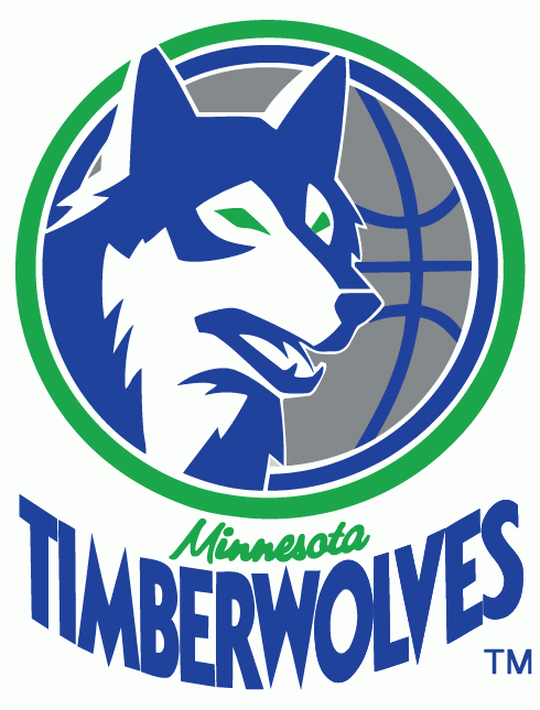
The Timberwolves were one of FOUR expansion teams to join the league for the 1989-90 season (the Orlando Magic, Miami Heat, and Charlotte Hornets were the others, should you ever need to answer that trivia question).
The Minnesota franchise ran a “Name the Team” contest and had to wave through 1,284 different options. It was, per NBA.com, “a potpourri of nicknames that no specific category could claim.”
The Timberwolves and Polars were the two finalists out of those 1,284. Minnesota houses more timberwolves (about 1,200) than any other continental U.S. state and is very cold, so both names are fitting.
However, Timberwolves won out, and a Minnesota resident named Tim Pope, who submitted the nickname, won a trip to the 1987 NBA All-Star Weekend in Seattle. That was a full two seasons before the Timberwolves would play a game, but hey, creating a team takes time.
I should note 16 other people also submitted “Timberwolves” as a team name. Those people won absolutely nothing.
Riding high off of their successful team naming, the Timberwolves also invited fans to design the first official team logo. Another Minnesota native, Mark Thompson (shout out to Austin, Minn.!), designed a logo that Club President Bob Stein called “aggressive, but not sinister.”
I’m pretty sure my dog makes that same face when he runs himself silly in the backyard, so I’d describe it more as “panting,” but you be the judge.
For his efforts, Thompson won $2,500, and the logo made its debut appearance on a $20,000 check donated to United Way locations in Minneapolis and St. Paul.
1996-2008
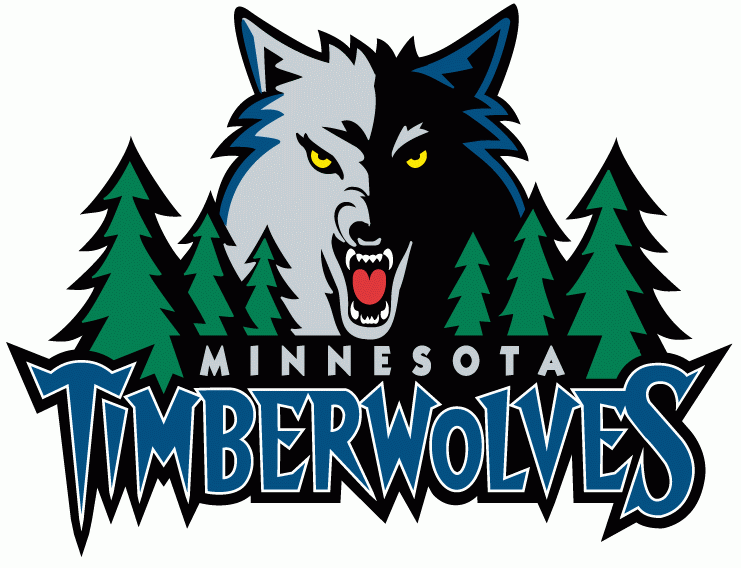
I own a Stephon Marbury reversible jersey from this era, and I love it so much. White on one side, that sweet blue on the other.
We’re going to get more into the cosmetic changes of this logo in the next session, but I need to point out how truly wonderful “Timberwolves” looks here.
The 90s logos were all about cartoonish flair, and the way this team name pops is one of the better examples of that in action. I’m still a bit scared by the wolf, but mainly I want to just rollerblade and spray paint graffiti with it.
2008-2017
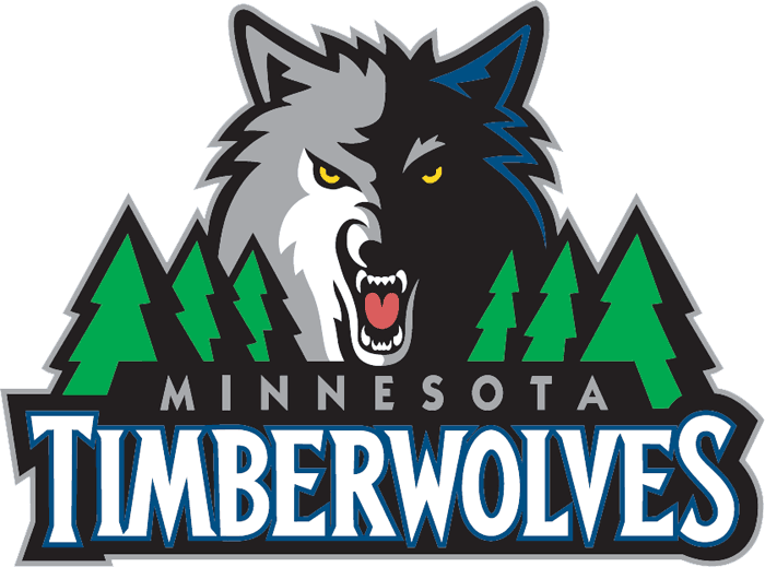
At first glance, this logo might seem pretty similar to the last one. But there are different nuances in everything here.
First, our big bad wolf. It’s more grizzled this time around. It still has that blue tint on one side of its face, but it’s gone from the other side. It’s also turned a darker gray and has a white streak around its mouth. That’s either from old age or eating a vanilla ice cream cone too aggressively, both things I am guilty of.
The trees have also diminished a little bit, in my opinion. They’re a more visually impressive shade of green (more of a kelly green than forest green) but I like how the previous version appears to be more varied (even though I think those trees are also the same size). These thicky thick trees make me feel like I’m in one of those neighborhoods where every house is built exactly the same way. This ain’t Pleasantville; it’s Minneapolis.
The “Minnesota” font is a little more faint and narrow, but the real downfall here is the “Timberwolves” portion of the name. It looks more “adult”, re: “worse”. I do like that the white text makes it easier to read, but I’ve always been fond of the ragged and rugged blue of the previous logo.
Oh well, no use crying over a previous logo. We’ve moved on, anyway.
2017-Present
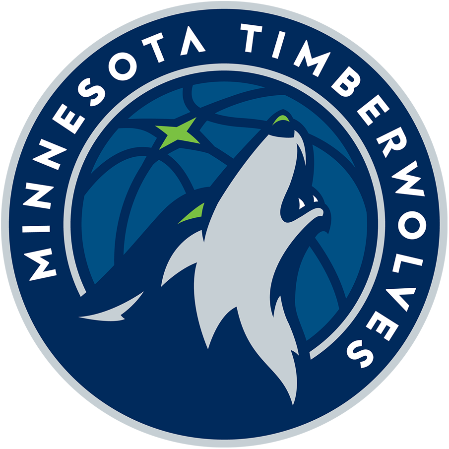
To be fair, the modern-day logo actually has a howling wolf. That’s rad. Plus, look at this laundry list of baller colors: Midnight Blue. Aurora Green. Lake Blue. Moonlight Grey. White.
Okay, four out of the five have cool names.
I also like how the wolf’s neck and body kind of looks like a mountain and/or a roaring wave, which is fitting because…of all the lakes in Minnesota? And if you squint hard enough lakes have waves?
You could also argue the wolf’s moonlight grey face looks like a banana peel. I won’t stop you.
This logo is especially notable for debuting the year the Timberwolves made the playoffs for the first time since 2004. As of this writing, they still haven’t made it back to the postseason.
Other reads and watches:
Dearica Hamby, Nneka Ogwumike, A’ja Wilson: WNBA players reflect on life in the “Wubble”
Ben Gordon: Where Is My Mind? [This is an older piece but I just read it yesterday and thought it was a really insightful look into mental health]
Zach Kram: Why is defense so hard to measure?
Tom Haberstroh: Bananas Russell Westbrook Triple-Double Stats
That’s all ’til next time. Thanks for reading!
Joey
P.S. Did you get this post shared with you? Subscribe to Crisp Bounce Pass here.