If you’re only now finding out about Crisp Bounce Pass, you can subscribe here!
If you’re enjoying Crisp Bounce Pass, please forward this email to your friends! 🏀
Today’s email is part of our “Branding Lowdown” series, which explores a team’s history as a brand. Today’s team? The Los Angeles Lakers.
These branding deep dives will generally be chosen randomly. However, the first installment of this series was the Milwaukee Bucks, who are #1 in the Eastern Conference. It’s only fair the Western Conference gets the same treatment, so the Lakers it is.
The Bucks are also making news after boycotting their scheduled playoff game on August 26 to protest the Kenosha, Wis. police shooting of Jacob Blake, a Black man who was shot in the back and left partly paralyzed.
Kenosha and Milwaukee are only about 40 miles apart, and the Bucks decided to boycott a playoff game to continue shining a light on social justice efforts.
The boycott prompted the NBA to cancel the other two playoff games Wednesday evening, as well. And it’s possible the season could be postponed entirely.
The Bucks aren’t the only ones voicing their opinions about what’s happening in their state. Players like the Lakers’ LeBron James have also demanded change.
There’s not a graceful way to transition from what’s going on in the world to the history of the Lakers logo. I hope everyone is paying attention and continues to educate themselves on what’s happening around us.
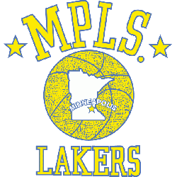
1947-1960
The Lakers have had a lot of great players in their storied history: Kareem Abdul-Jabbar (probably more well known for his starring role in Airplane!), Magic Johnson, James Worthy, Jerry West (the NBA’s logo!), and LeBron James are the names of five men who have played for the team.
Now, you may wonder why a team based in Los Angeles is called the Lakers. Per Wikipedia, Los Angeles County only has nine lakes. That seems pretty silly, when a name like the Los Angeles Celebrities, the Los Angeles Walk of Fame, or the Los Angeles Designer Sunglasses would all be more fitting monikers.
Instead, we get the Lakers because the team started out in Minnesota, which is nicknamed the Land of 10,000 Lakes (even though there are 11,842 lakes in the state).
The Minneapolis Lakers began play in the National Basketball League during the 1947-48 season, and then moved to the Basketball Association of America (the forerunner to the NBA) the following year.
This is actually the most unique of the Laker logos. It’s one of the few team logos out there to feature the city name twice – in the form of the MPLS abbreviation (no, that’s not some kind of maple syrup reference) and the handy location on the map.
A logo that’s unique AND educational? Count me in.
1960-1976
![]()
![]()
Of course, once the team moved from Minneapolis to L.A., they needed a new logo.
You could argue they needed a new team name, too, but that’s not the point here. Lakers could stick around. Minneapolis (x2) had to go.
The team ditched the verticality of the MPLS logo and went for a more “streaking” look. The Lakers logo appears to be running (or swimming, if you will) across the ball.
This version of the logo is the first with the familiar purple and gold color scheme we know and love today, but it looks a little more rough and tumble here.
The Lakers’ playoff success during this time period may have played a factor in the eventual change, too. The team reached nine NBA Finals, yet only one won championship. When the squad struggles on the court, something’s gotta change.
1976-2001
![]()
![]()
That something was the color and size of the ball and text, which seem like minor details to the untrained eye. But look at how much cleaner this logo is.
The little tentacles on the R are more obvious, everything is easier to read, and the ball has been rotated so you can see the state outline of California if you squint your eyes a lot.
Another minor, yet, massive change here? The ball now has a black outline around it. Pass me the rock!
2001-Present
![]()
![]()
We talked about the initial L.A. Lakers logo getting a facelift in the midst of a “struggle,” yet this one happened during the middle of three straight championships.
In 2001, Shaquille O’Neal, Kobe Bryant, and the rest of the Lakers had just won their second championship in a row, losing only one playoff game the previous year.
That one loss happened in the NBA Finals and featured Philadelphia’s Allen Iverson stepping over Tyronn Lue — one of the most delightfully disrespectful moves in NBA history. But that’s a story for another day.
There’s not a huge amoung of change going on here, other than the ball becoming a bit more golden honeydew and the team name diving closer to royal purple than lilac. You know what? I may have missed my calling as a namer of crayon colors.
That’s all ’til next time. Thanks for reading!
Joey