Today’s email is part of our “Branding Lowdown” series, which explores a team’s history as a brand. Today’s team: the Miami Heat.
Congrats, Miami — you’ve made it into the NBA Finals. Very proud of you. Alongside the Los Angeles Lakers, you’ll be competing for the championship in easily the weirdest NBA season ever.
It should be an exciting series, but today, let’s look at the logo history for one of the league’s youngest franchises.
1988-1999
![]()
Back in 1987, Florida had exactly zero NBA teams. Orlando, Tampa/St. Petersburg, and Miami all wanted in on the action. The NBA initially approved teams in Charlotte and Minneapolis, but couldn’t decide between Orlando and Miami.
That led to some (pun absolutely intended) MAGICALLY HEATED moments between the two cities, probably reminiscent of a brawl breaking out on Jerry Springer.
In the end, the NBA awarded each city with a franchise, and the Miami Heat was born. The Heat nickname narrowly edged out Miami Vice, but the latter has made appearances in Miami’s “Vice City” jerseys. Truly the pinnacle of NBA style.
Like most expansion teams, the Heat was pretty terrible in the early days, winning just 57 out of a possible 246 games in the team’s first three seasons.
Miami artist Mark Henderson created this logo, which lasted for more than a decade. It emulates a sizzling ball going through a hoop, successfully predicting the craze of NBA Jam and “he’s on fire!” several years before it actually happened.
If you want to think of this logo as a variant of the Skip-It toy, that’s okay too.
1999-Present
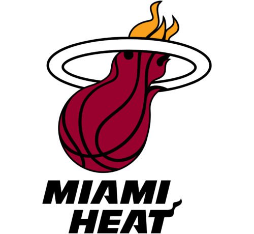
The logo got a bit of a makeover just before the turn of the century. The yellow flames are more pronounced, and the white lines on the ball are now black outlines instead. The ring also has an outline, making things look a bit more 3D.
However, Henderson’s influence is alive and well here. The “T” on “HEAT” is still on fire and/or waving a handkerchief, and the As have cool diagonal bridges.
I think I prefer the “.png” look of the original logo, but this one is still pretty good.
These are the two main logos the Heat has had in their short yet accomplished history, so let’s take a look at an alternative symbol for the Heat.
Too Hot for Full Names
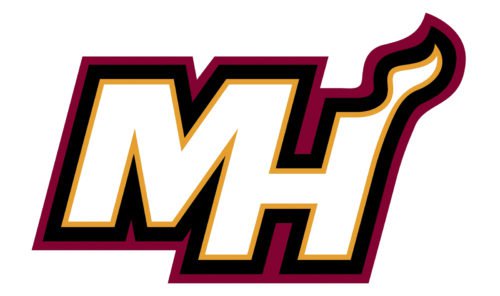
This “abbreviated” logo keeps the spirit of the two main logos alive. The H is still lightly on fire, though this looks a little more like a candle wick burning in the night than either of their other logos.
The M turning into the H is a nice touch, too. As a bonus, you could raise the middle line higher and add a P to it for a nice lookin’ MPH that would fit right at home in a Fast and Furious movie. Nothing comes before family, you know?
That’s all ’til next time. Thanks for reading!
Joey
P.S. Did you get this email forwarded to you? Subscribe to Crisp Bounce Pass here!