Today’s email is part of our “Branding Lowdown” series, which explores a team’s history as a brand. Today’s team: the Memphis Grizzlies.
The Grizzlies are one of the league’s newest franchises, and after being among the worst teams a year ago, they put together a solid season in 2019-20, making the play-in series during the NBA Bubble before bowing out to the Portland Trailblazers.
And as you may remember, the Grizzlies started out in an entirely different country. Let’s see how their journey took them to where they are today.
1995-2001
The Vancouver Grizzlies and Toronto Raptors both joined the league in 1995 as the NBA expanded into Canada. The Raptors won the title in 2019 and came within a game of the Eastern Conference Finals in 2020, while Vancouver’s team lasted only six seasons before moving to Memphis.
Fun fact: The Grizzlies were the first NBA team to have a website, which was designed by Bob Kerstein, their Chief Information Officer.
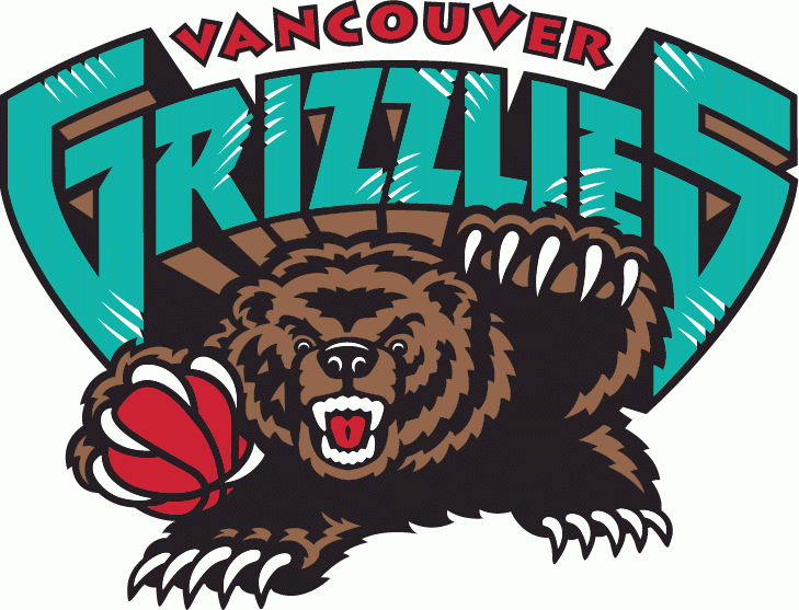
Setting an NBA record for most claws ever in a logo with 60, the Vancouver Grizzlies had a bear of a time getting off the ground. The team went 101-359 over six seasons. They finished last in the league three times and never won more than 30 percent of their games in a single season.
Even with all that losing, I still enjoy this logo, which very much embraced the over-the-top cartoonish style of the mid-90s. Sure, teal (the most sus color in Among Us) is an odd choice to have as your main look, but the bear is doing its best to defend its home turf, and that’s admirable.
2001-2004
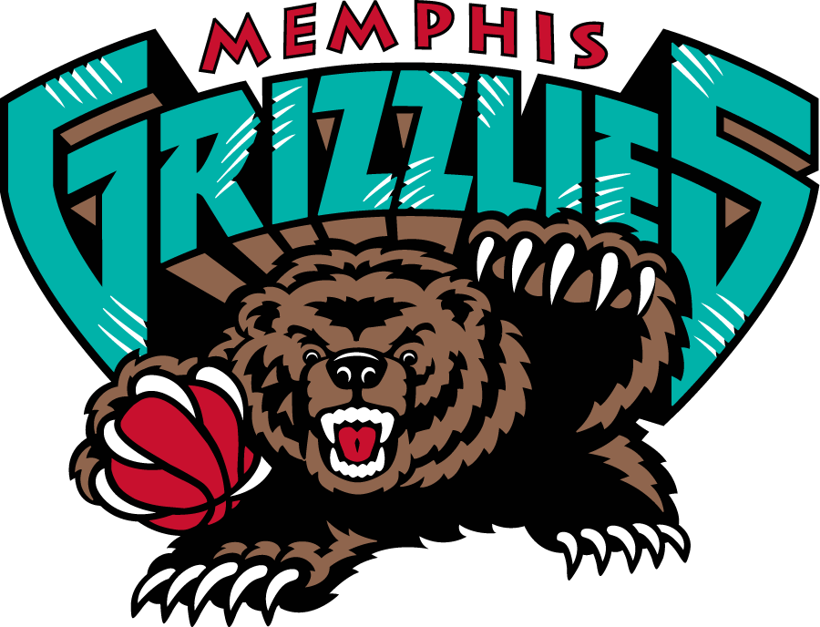
When the team moved to Memphis, it seemed the Grizzlies weren’t quite ready to part ways with their logo — or perhaps they just didn’t have anything better to switch to.
The only difference between this one and the Vancouver iteration is the city name at the top. It wouldn’t make much sense to have “Vancouver” now that the team is in Memphis, but it sure would be pretty funny.
2004-2018
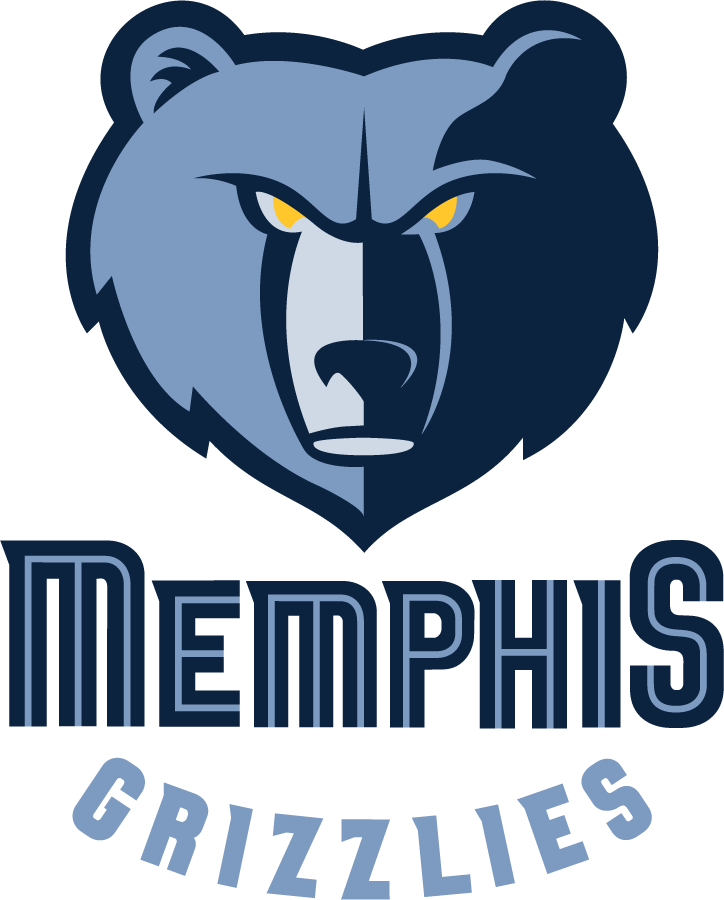
However, Memphis needed to make their logo into something unique, so in 2004, they swapped to a new version with the grizzly on top.
The teal color scheme also disappeared, replaced by a few different shades of blue. The grizzly itself does appear more intense, despite the logo dropping the number of claws from 60 to zero.
This was probably not the team’s intention, but the curved “Grizzlies” reminds me of a smile. So even though the grizzly is…ahem, grizzled and angry on the outside, it’s probably a big ol’ softie on the inside.
I also can’t help but think the snout looks a bit like an oak barrel you might find at a distillery. Perhaps it’s a whiskey connoisseur, too.
2018-Present
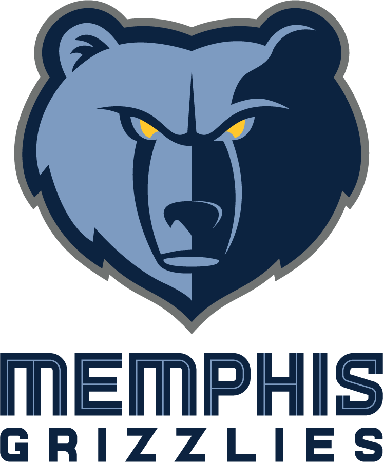
The Grizzlies made a few changes before the 2018-19 season, largely to update the wordmarks — both “Memphis” and “Grizzlies” are stylized differently.
Finally, there’s a gray outline around the grizzly’s face and there are also supposedly fewer lines on its snout (though I have a hard time spotting the difference).
If the fewer lines on the face are, in fact, true, this grizzly is pulling a Benjamin Button on us and is defying time but getting younger. So impressive.
That’s all ’til next time. Thanks for reading!
Joey
P.S. Did you get this email forwarded to you? Subscribe to Crisp Bounce Pass here!