If you’ve been following along at home, you’ve noticed the NBA Finals are going on right now. We previously covered one participant, the Milwaukee Bucks, in a previous issue. And yes, that deer wearing a sweater logo is still magical.
So, it only seems fitting that we also chat about the other participant — one of the hottest teams in the league, the Phoenix Suns.
How did the franchise rise from the ashes of non-basketball to come just two games away from winning its first-ever championship?
Only one way to find out: let’s do a Branding Deep Dive!
1968-1992
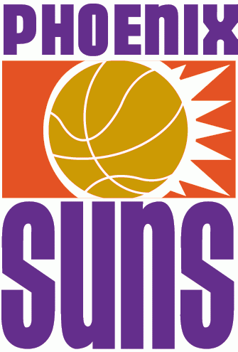
Back in the late 1960s, no one thought Phoenix could sustain an NBA team. Richard Bloch, the driving force behind the primary Suns ownership group, approached then-NBA commissioner Walter Kennedy about bringing a team to the desert.
Kennedy’s response? “You’re crazy for this one, kid!”
Hmm, that might not be a direct quote, but still: Kennedy and naysayers thought Phoenix was too hot, too small, and too far away to be successful.
Bloch kept prodding, though, and he finally convinced Kennedy to chat up some Phoenicians. Kennedy spoke to “half a dozen shoeshine boys, a couple of barbers and some taxi drivers,” and he was convinced — this could work, after all.
The then-unnamed franchise hosted a “Name the Team” contest, receiving a whopping 28,000 entries. And again, because Phoenix is hot as all getup, “Suns” was the winner.
We had to wait a little longer for the logo, though. Co-owners Don Pitt and Don Diamond (a pair of Dons!) paid $5,000 to a commercial artist for a logo that was TRASH. Rather than taking that trash logo, Don x2 hollered at Stan Fabe, a Tucson commercial printing plant owner.
Fabe came up with the basis for the sunburst logo we know and love today. And he did it all for the bargain price of $200!
I think this looks like an old logo, and…well, it is. It’s a bit washed out and seems a little basic. But it does lay a great foundation, and that’s what’s important here.
To market to fans, the Suns emphasized their temperate weather, saying that because it barely rained, traveling to and from games would be very easy. Hey, whatever you gotta do to sell tickets.
The Suns inaugural season started off promising. The team won its very first game 116-107 over the Seattle Supersonics. They even had a winning record at 4-3 after the first seven games.
By the end of the season, the team was 16-66. Losing 63 of your final 75 games isn’t good no matter what sport you’re in. But there was excitement on the horizon!
1992-2000
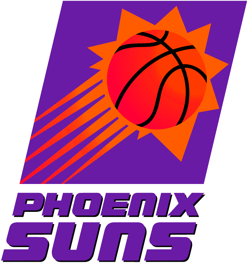
For the team’s 25th anniversary, it changed its logo to one that’s pretty close to the modern-day branding. Personally, this is my favorite of the bunch — I like that it doesn’t have a border. The sun is expansive; don’t put it in a box!
The team celebrated its new look by trading for Charles Barkley. We all know and love Barkley as the guy who says whatever’s on his mind on Inside the NBA and as the occasional prankster, but he used to be a darn good basketball player, too.
And that 1992-1993 season, Barkley won the league’s MVP award. He also brought the Suns to the NBA Finals, where they ran into the buzzsaw that was the 1990s Chicago Bulls.
Even though the Bulls delivered a dagger in the form of “The Shot,” the city still tossed out 300,000 fans in 105-degree heat to celebrate the Suns’ Western Conference title.
You gotta love that commitment.
2000-2013
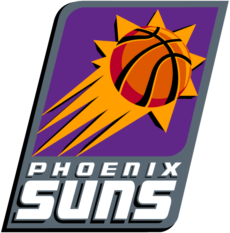
At the turn of the century, the Suns wanted to gray things up a bit. The most notable change is the gray border and the purple “Phoenix Suns” becoming white.
There’s a bit more, though. The basketball looks more CRISP here (perhaps ready for a bounce pass) and doesn’t have nearly as many streaks emitting from the sun.
This era earns the nod for my favorite alternate logo of the Suns. This secondary look features wildly cartoony PHX script and a flaming basketball, but the flames are also in the shape of a phoenix, the mythical bird.
These Suns are perhaps my favorite of all the Suns. We had Steve Nash running the fast break and occasionally starring on The Late Show with David Letterman, tossing alley-oops and wild passes to Amar’e Stoudemire and Shawn Marion. And it was VERY entertaining, albeit it never led to a championship.
2013-Present
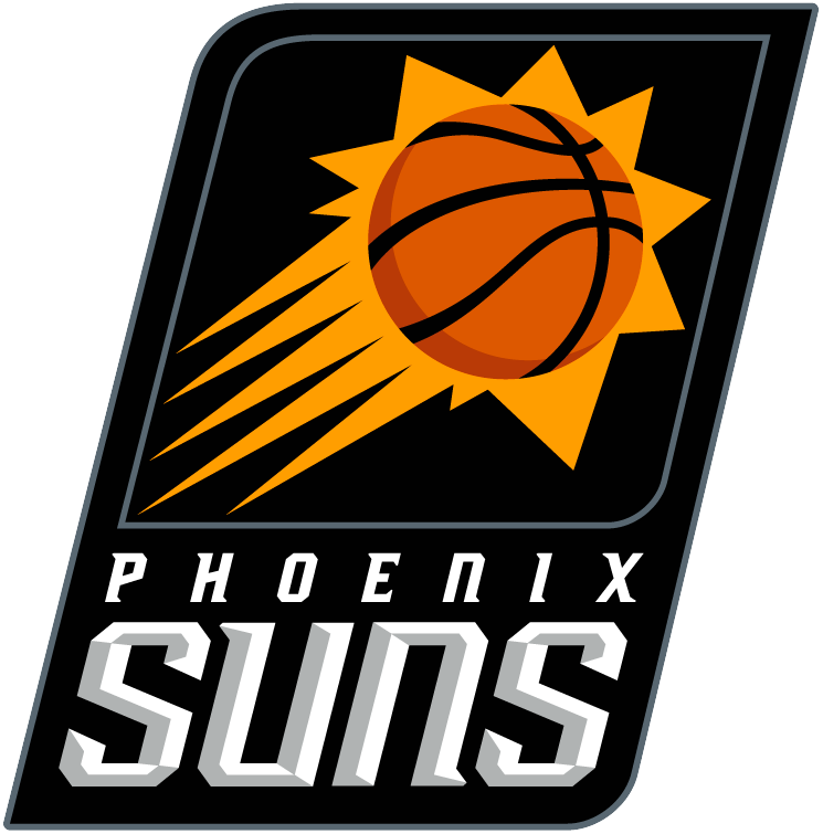
The Suns’ current logo looks sleeker in every way. “Phoenix” and “Suns” are both slimmer (the opposite of me during quarantine) and the ball is spun ever so slightly.
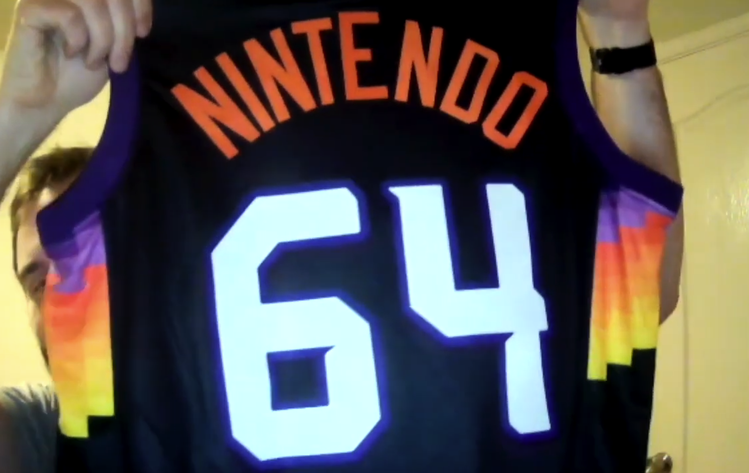
But let’s be honest — the real highlight here is the team’s “The Valley” jerseys. These duds look like a giant game of Tetris and I am 100% onboard with it.
I don’t think I would have gotten this stupid novelty jersey with any other squad, and I’m not even a Suns fan. It’s just that stylish.
Other Reads and Watches
Matt Brown on whether college athletes can now start Only Fans accounts after the new NIL ruling
Kareem Copeland on the unpredictability of this WNBA season
Sean Gregory on Sue Bird’s quest for Olympic glory and off-court equity
Ky Carlin on Brett Brown apologizing to Mikal Bridges’ mom after his hometown 76ers traded him
That’s all ’til next time. Thanks for reading!
Joey
P.S. Did you get this email forwarded to you? Subscribe to Crisp Bounce Pass here.